Friday, September 19, 2008

Eduardo Recife


Eduardo Recife is a Brazilian " illustrator, graphic designer, and typography aficionado." He does freelance illustration and design, and also produces great fonts, some of which he gives freely for personal use. Most of his imagery comes from vintage magazines and prints; beautiful work. I have linked to both his personal and professional websites.
Check them out!

http://www.eduardorecife.com
http://www.misprintedtype.com/v4/

Wednesday, September 17, 2008

Good Site for Free Vector Images

Hey everyone. I stumbled upon this list of 10 good sites for free vector graphics that you can use for your projects. Click

Work


Yup, so...three images one, an ensemble of artifacts and flora, another, the earth and the moon, suspended.


The Third, A commentray on the evolution of our craft.

Bringing light to simple objects


When receiving this assignment, I had no idea what items I was going to scan. I went in my apartment and found the simplest items I could find, to see if i could put beauty into its simplicity. I tried to brighten the shells and tweak the color a little bit to bring life to the object. The matches on the other hand I had trouble trying to make them different then it was originally. I cloned the only match left and cloned it many times so it doubled and made it look like a full box of matches. I tried to connect Buddha with the matches, by attaching a copied pipe to Buddha's mouth. However, when done scanning I realized that Buddha, the matches, and the shells I didn't really have a complete theme, but I was able to learn techniques that will be useful later on.

4000 feet till winter


Many people refer to me a crazy kid....ive always seen myself as someone who's just love to go outside and play. No matter where it is or what im doing, i dont want to be doing it if its not enjoyible. In my images ive incorporated what i belive represents certain parts of my life. Moutains, the surf, street and snow.

My stuff


This is my set of pictures. I am not too fond of them but I don't ever tend to be too fond of any of my art work so thats not saying much you know?
Everything but the backgrounds was scanned in and altered.
Sorry they are out of order


This Is Your Vice


As a resident of the Old North End of Burlington, I am faced with the vices of others on a daily basis. From finding used hypodermic needles in my yard to the news of murder and rape on my street, I am in constant awe and terror of the behaviors of my neighbors. I titled my three pieces "This Is Your Vice" after the addictions that these items represent; drugs, sex, gambling, and violence.
The three pieces represent the cycle that the vices might take. The first one represents the vices in a package, the second represents the usage, and the third represents the remains or waste from the vices.
I scanned the items, touched them up, and rearranged them using Photoshop.
I in no way condone or advocate these items or behaviors.

Monday, September 15, 2008

Clip


Knife


Copper Faces

This series was an experiment in contrast both in color and texture. I tried to create motion with the fabric while the items remained stationary, and to achieve this the number of objects placed on the scanner were minimal. Some of the items redirect the implied motion of the piece, like the clip in the image with the red scarf.

The beauity of a cigarette


These are my scanography pieces. 'Bottled' is cropped from a larger image. Though simple shapes and color are used to create a fractured whole, I think that in its simplicity it does fine and dandy standing alone. 'Latch' and 'Bean' were completed on the second day of scanning. As I became better acquainted with the concept behind the assignment, I began to select what attracted me most on a walk through grass and road. I had the idea to look for similarities in nature from different places on the land (i.e. underground-roots, surface-clovers, air-leaves) to create a unified image of nature. I really enjoy the two differing color schemes and believe that both have a sense of circulation within themselves. The end.

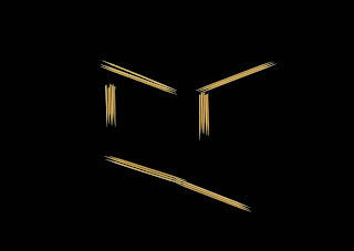
Emotional Skewers


These three images were my scanography project pieces. They were made using skewers, some in there original form, others snapped in half. I wanted my pieces to be simple, but also relate to each other without losing any simplicity. I think that if they were viewed individually without ever seeing any of the other two, it would be more difficult (minus the smiling one) to identify what exactly the skewers were portraying. As a collection, however, it is very easy to identify what each is showing, since they each relate very closely to one another.

Pencils


Pencils is an experiment in form. I wanted to do something where the subject matter was not important. These are pencils, but they could be sticks, metal metal rods, pieces of spaghetti, or any other straight-line object. The idea is all in the form and composition of the piece. Just shapes floating in space.

What....up....?

Yo